Report on Bounced Marketing Emails (Mailings)

Oracle Service Cloud comes with several reports that allow the analysis of the emails sent to customers by the use of the Outreach facilities of the platform. Those out-of-the-box reports track the accuracy of email delivery and show activity and performance for both broadcast and transactional mailings.

They display the number of marketing emails that have been sent and delivered. The number of emails open, links clicked and unsubscriptions requested. The number and percentage of emails that could not be delivered. As well as the types of email bounces that prevented them from being delivered.

This information is grouped by Mailing. i.e. the user can select a particular Mailing and the report shows the above information for that specific Mailing.

This was not enough on one of the projects my team was working on. The requirement was not only to see the number of bounces, but actually be able to identify the name and email address of the person to whom the Mailing was not delivered.

By using a simple join between the Marketing Activities (ma_trans) and the Contacts (contacts) tables, we were able to deliver the report that showed the intended information. See report and definition below.

20150502 Oracle Service Cloud - Bounced Emails by Mailing

Report Definition: Oracle Service Cloud – Bounced Emails by Mailing

Analytics: Dashboards

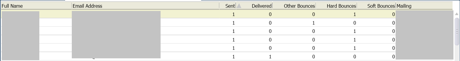
When viewing standard or custom reports, you generally open reports one at a time, and search for data in only the report that is active. However, you can view and search for data in several reports simultaneously by adding them to a dashboard. Each report in a dashboard retains the same functionality as if you opened the report separately, allowing you to access and work with a variety of data from one dashboard.

Dashboards are particularly useful for managers who need to view a wide range of data from different reports. Using dashboards eliminates the need to open a large number of reports individually. Using dashboards eliminates the need to open a large number of reports individually.

Dashboards are created and edited on the dashboard design centre by dragging reports to the dashboard, adding optional descriptions, images, text, and controls, and configuring display options.

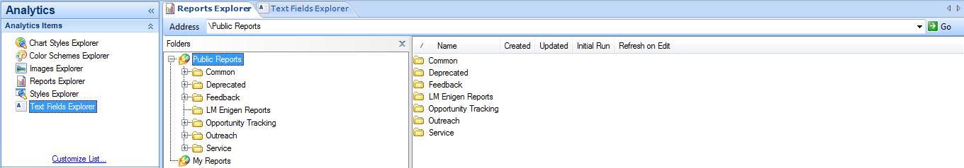
To open the dashboard design centre:
1. Click the Analytics button on the navigation pane.
2. Double-click Reports Explorer.
3. Click the New Dashboard button to create a dashboard.

The following image shows the dashboard design centre.

img6

You can also add tabs to the dashboard to place additional reports and other content that may not fit on the dashboard’s main page. Each dashboard can have a maximum of 50 items placed on it.

If you add private reports to a dashboard, other staff members can view the reports when they open the dashboard.

Dashboard options allow you to select the time zone that should be used for the reports in the dashboard, change the dashboard owner, and modify settings that impact how the dashboard functions when it is opened for viewing. You can also configure automatic refresh of the data shown in the dashboard’s reports, select data source options, add notes to the dashboard, change the image displayed for the dashboard in report lists, and schedule the dashboard to be sent in an email.

You open dashboards just as you would open a regular report from the Reports explorer or one of your navigation lists. Dashboards can also be opened from links you add to reports. When you open a dashboard, it loads with current report data. You can also queue dashboards to view them at a later time.

The dashboard includes options similar to those accessed from the Report tab when viewing a report. The dashboard also includes docked filters that are common to the reports in the dashboard and may include tabs to access reports on other dashboard pages.

Since every report in a dashboard is fully functional, you can access the standard options available when viewing a report to sort columns, show or hide columns, and add column calculations. If the report and the permissions allow it, you can also access records listed in the reports or edit them inline.

When you open a dashboard, the dashboard’s ribbon includes Home and Page Setup tabs. You can use the options on these tabs to print the dashboard and adjust the dashboard’s display and output. When you select an individual report on the dashboard, the ribbon is updated to include additional tabs containing options for modifying the selected report.

The buttons available on the Home and Page Setup dashboard tabs let you open the Search window, refresh the display, select display options, forward the dashboard, configure print options, and perform other actions that impact the entire dashboard.

Dashboards can be queued to run at a later time just as reports can. Dashboards can be manually queued or automatically queued. Once a queued dashboard generates, you can view the dashboard using a standard report or a notification just as you can with queued reports. You can queue dashboards containing reports that you think may query or return large amounts of data. This is also helpful if you want to view a number of dashboards but do not want to wait for each to generate.

After you queue a dashboard, you can use standard reports located in the Reports explorer’s Public Reports > Common > Site Administration > Reports folder to see the dashboard’s status in the queue. Once the dashboard runs and is ready to view, you are notified and you can open it from several locations.

Analytics: Introduction to Analytics Explorers

The reporting features in RightNow CX are accessed through the RightNow Analytics explorers. From these explorers, you can create custom reports and dashboards, view standard and custom reports, and edit report styles, chart styles, colour schemes, images, and text fields to use with reports and dashboards.

Reports Explorer
Reports are contained in folders in the Reports explorer. These folders are in a tree structure and can be expanded or collapsed to hide or display their contents. Reports that are accessible by multiple staff members are contained in the Public Reports folder, and private reports that are accessible only to the staff member who created them are stored in the My Reports folder.

img1

Styles Explorer
Report styles allow you to quickly apply custom display settings to your reports without editing the underlying report. Styles can also help staff members use the same display settings for their reports so that all reports generated by your staff share the same appearance. You can easily create and edit styles to define the specific fonts, colours, borders, and margins which are most appropriate for your target audience.

You can edit style options for various components used in reports, such as text fields, column headers, exceptions descriptions, or entire report sections. You can also associate a custom chart style with your report style that will be applied to charts added to reports.

img2

Chart Styles Explorer
RightNow CX lets you create chart styles to define the appearance of charts shown on reports. By applying a chart style, you can immediately change a chart’s fonts, colours, scales, grid-lines  backgrounds, and other display attributes. The Chart Styles explorer includes several predefined chart styles, which you can apply to charts, and allows you to create custom chart styles. You can then apply the same chart style to charts in different reports to ensure that all the charts have a similar appearance.

img3

Images Explorer
Photos and other images can be uploaded to use in reports and dashboards. For example, your organization’s logo can be added as an image and then added to custom reports.

The images used with reports and dashboards can be added and replaced using the Images explorer. The ability to replace images is helpful when an image, such as a corporate logo, is modified. Once the image file is replaced, the reports and dashboards with the old image automatically use the new image.

img4

Text Fields Explorer
The Text Fields explorer lets you create text fields you can add to custom reports and dashboards. When you create a text field, you can specify the field’s text, fonts, borders, colours, and margins. You can also adjust these settings after you add the field to a report or dashboard.

For example, you could create a text field with your organization’s name, using your organization’s preferred fonts and colours, which you could add to your reports’ titles. Since the text fields can be edited once they are added to reports, you can also create a template text field with your customized settings and change the wording in the field as necessary.

img5